
The delivery of your message depends on how you create the difference in your design. That’s the reason why contrast is one aspect you shouldn’t underestimate in typography. Let’s consider your typographic contrast carefully. Take our guide to understand how to create contrast variance in your design!
What is Typographical Contrast?
Contrast refers to the dissimilarity between two elements or more that complement each other and roles as one of the fundamentals of typography. As a result, these diverse elements create a perfect balance, harmony, and composition in your design.
Furthermore, the type contrast allows you to:
- create a distinct order and hierarchy;
- provoke emotions;
- emphasize and de-emphasize some elements;
- improve readability; and also
- beautify your design.
Thus, mastering the typographical contrast allows you to improve the overall design message. Moreover, your design will be more standout and attract readers’ attention.
Typographic Contrast According to Carl Dair
In regard to typography, Carl Dair is one of the most renowned typography experts. His notable work, Design with Type, was published in 1952 and still is a relevant handbook for typographic designers today.
According to his work, there are seven elements for typographic contrast examples. The elements include size, weight, form, structure, texture, color, and direction which are essential to create contrast in your typography design work.
Also Read: What Is Leading In Typography? With Rules and Examples
Delve Deeper into the 7 Elements!
The combination of the elements that Carl Dair indicated allows you to create a unique composition. For example, when you want to create a heading, you will use a large size of typeface with a heavy weight and in a different color from other copy text. Let’s look at these seven fundamental aspects of the type contrast below!
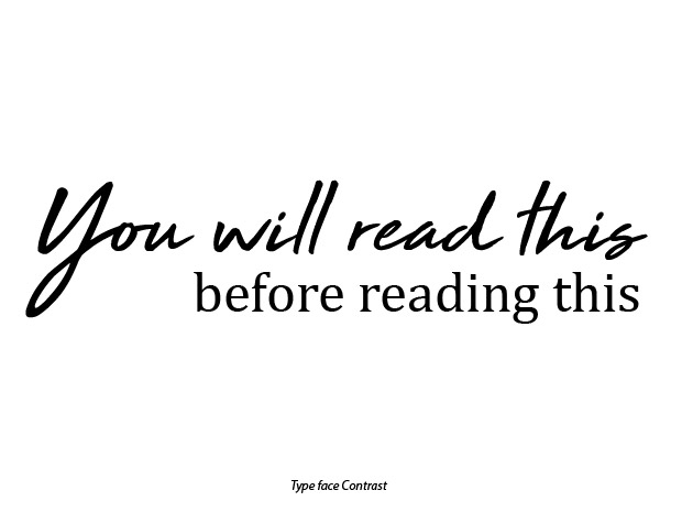
1. Size
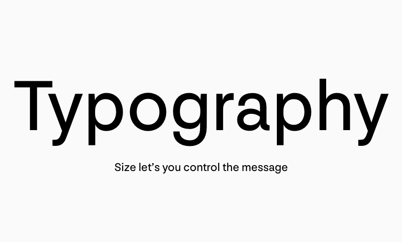
Size is the most obvious and basic factor that matters in creating the type of contrast. It requires a simple method yet gives a powerful effect. The contrast in size contributes to creating a visual hierarchy that guides readers’ attention.
Eventually, it will lead readers to go from the most critical information to the less important or trivial information.
For instance, when you enlarge the text size such as a headline, the reader will notice that part first since it becomes the focal point. On the other hand, if you reduce the text size, for example, an image description, the text will be unnoticeable.
Also Read: Typographic Hierarchy: Explanation and Examples
2. Weight
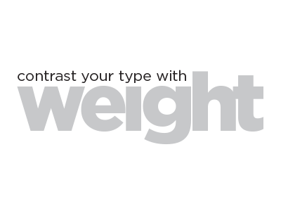
The next aspect of a typographic contrast is weight. Weight means the thickness or thinness of the letterform. You can create a vast distinction by changing the weight, even if you use the same typeface style. Moreover, the variation between thin and thick font weights could give different emphasis, meaning, or vibe.
For example, the heavy text could evoke an impactful mood of persuasion, alertness, and attraction. Therefore, the heavy-weight text fit for headlines, headings, keywords, or words that need special attention. However, the too-heavy text might reduce your design’s readability.
3. Form
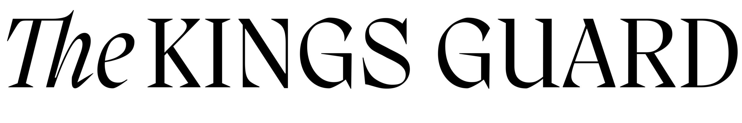
You can build a contrast in your typography design by playing around with the form. Generally, form refers to the basic shape of the letterform. For instance, there is a difference between uppercase letters and lowercase.
The composition of Roman letters and italic or oblique variants could also create contrast in typography. However, you have to avoid a combination of italics and oblique text. The reason behind this is that they have a similar shape. Hence, the combination of those two could create conflict instead of a contrast.
Also Read: What is a Typographic Scale? And How to Use It?
4. Structure
Structure refers to a typeface style that creates a different tone and mood and is an important factor of typographic contrast as well. Namely, sans serif typefaces represent simplicity and modernity tone. Meanwhile, the traditional serif would suit for authoritative and formal mood.
You can also combine different styles of typeface to create an awesome contrast, like the combination between serif and sans serif fonts.
5. Texture
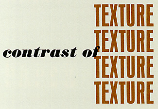
The combination of size, weight, form, and structure in a block of text could create the contrast of texture with a more dynamic composition. Texture means how your typographic design will visually look at an up close and a distance.
6. Color
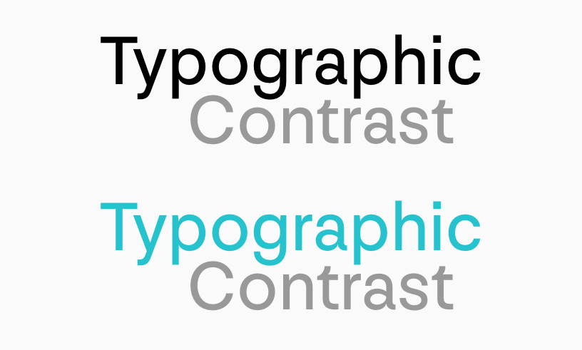
Color contrast allows you to convey more than what you want to express. Although color could produce contrast in your design, you must beware of using it since using color for creating contrast can be tricky.
Whenever you want to use color to give contrast to your design, think carefully about picking and combining colors. The color should convey your brand’s tone and identity, while also delivering the message and maintaining readability.
7. Direction
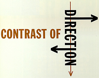
The last aspect of creating contrast is direction. It refers to the orientation of the text, like vertical, horizontal, or diagonal. Using direction could build a dramatic effect and draw people’s attention.
However, be careful with vertical and diagonal directions. You may avoid using those positions for body text and only use them for headlines, subheadings, and short messages since they would be harder to read.
Is Typographic Contrast Important for Designs?
Maintaining contrast is a critical aspect of making your design attractive and readable. Don’t be afraid to combine every typographic contrast element with proportional composition to create a fascinating contrast that will help your visual design stand out.
Opt for one of the display fonts collection from Creatype Studio which has rich options for typefaces design and comes with contrast in unique styles for outstanding designs!