
If you’re on a journey to build your dream website design, you gotta combine both creativity and user experience. However, being too creative can compromise user experience, reduce engagement, and even lose revenue. So, let’s talk about bad website design and learn together!
5 Bad Website Design Aspects You Should Watch Out!
A website is generally built to help people get to know the company while helping them discover our various offers. However, even a big company can miss the “help people” part and assume they are smart enough to navigate or just too excited to offer their products. These can lead to a bad website design in the following elements.
1. Cluttered Layout

Cluttered Website Design | edition.cnn.com
A cluttered website overwhelms users with either too much text, photos, other information, or just elements. This can lead to confusion and make it hard for users to find what they’re looking for. Let’s take a look at an example of a bad website design:
Example: Arngren
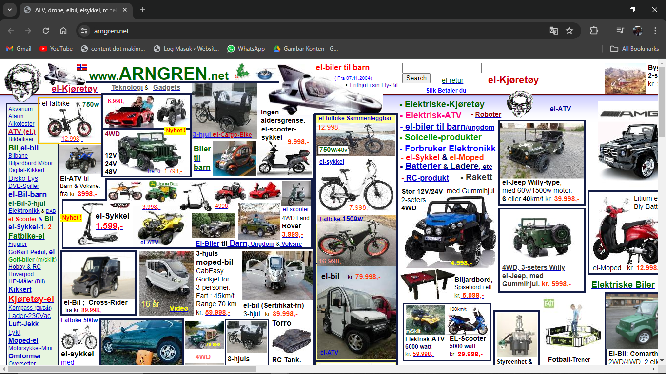
Cluttered Text and Images | argren.net
As you can see, the website is full of colorful text and pictures. Although we can assume that it’s a website to sell things, the layout is all over the place. According to Netlify, it is a Norwegian website that sells weird gadgets and appliances, although we can only see vehicles there.
Also Read: Bad Kerning in Typography: Here Are Also The Examples and Tips
2. Poor Navigation
The hero section is generally the big middle one and the navigation section is the little text around it (usually on the top or left side of the hero section). Seems straightforward, right? However, a poor navigation section is a bad website design that will lead to hindering customers’ journeys through your site.
Example: RISD Museum
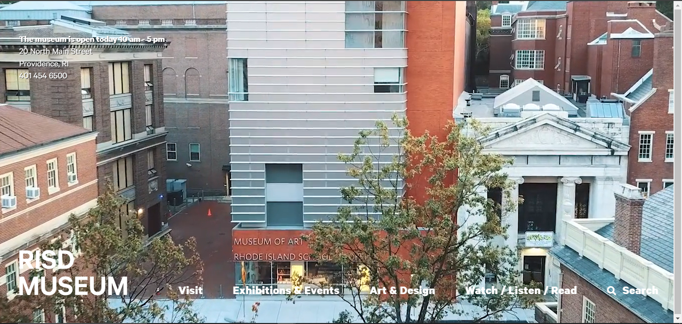
Poor Navigation Menus | rsidmuseum.org
In this case, the website has flipped its navigation menu at the bottom of the screen and its address at the top. You might skip the address that was there all along because all texts have no background color or borders. Hence, this kind of navigation feels a little odd.
The cluttered layout is overwhelming, but too simple is also a problem.
3. Slow Load Times
A website that takes too long to load can drive people away. This bad website design will certainly cost you some conversions. Large images, excessive scripts, or inefficient server configurations might be the culprit here.
Example: TECA Projekt
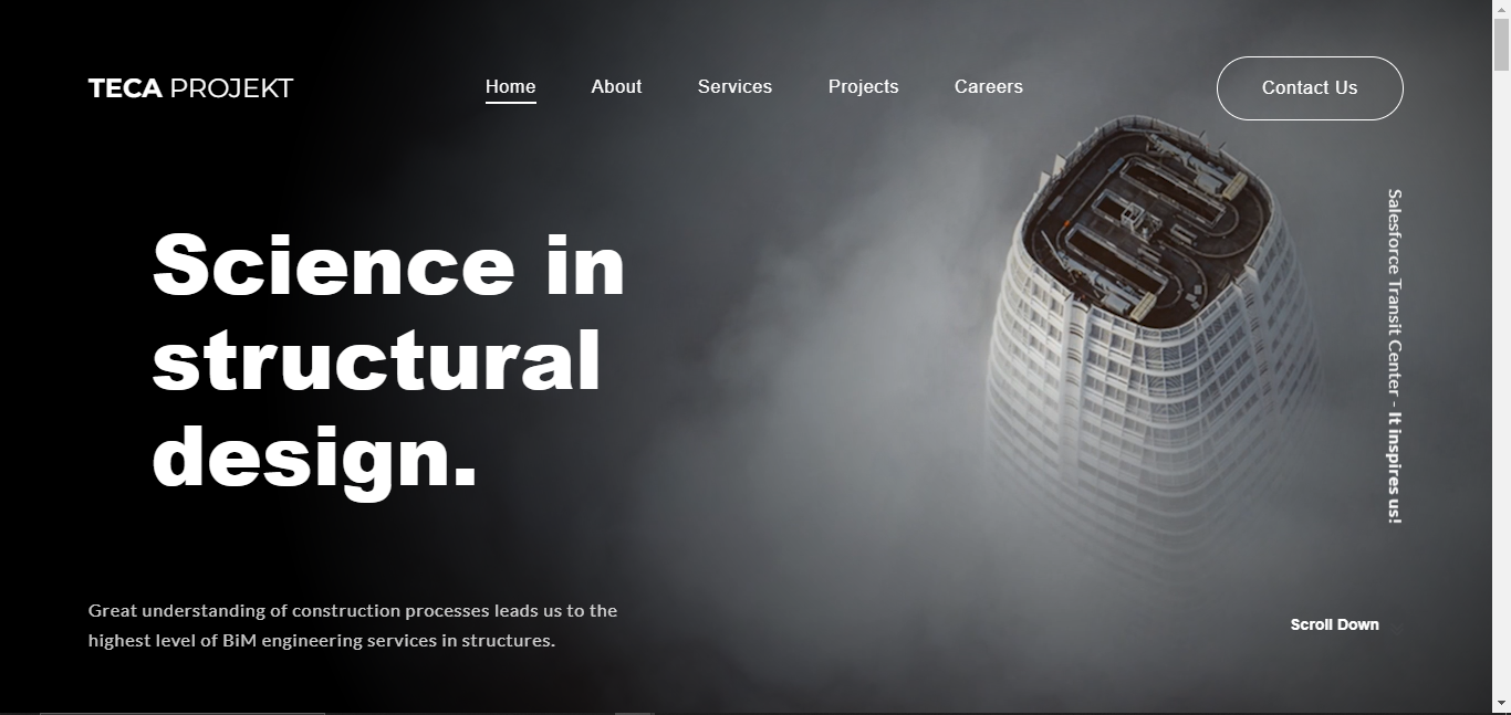
Long-loading Website | teca.ee
This representation of TECA Projekt is pretty good, but certain aspects aren’t quite right. First, to get here, you need to wait. Second, the navigation shows no arrows for sub-menus such as Services and Projects. Third, they need the “Scroll Down” text because the hero section is filling the screen.
So, this beautiful picture is too big and makes the website load longer. When you scroll down, it will not be smooth because more partially-loaded pictures will emerge. Simplifying the website is better, use good quality and small-sized elements.
Also Read: Interactive Web Design: 5 Tips to Invoke Your Creativity
4. Too Many Advertisements
Excessive or invasive ads can be a significant turn-off for users. Ads like pop-ups, auto-playing videos, and large banner ads will certainly disrupt the user experience. There are many popular websites with bad design that use these invasive ads.
Example: Forbes
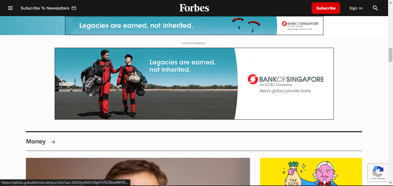
Bad Website with Too Many Ads | forbes.com
Forbes is one of the websites with many ads. Once you visit the website, your screen can suddenly turn dim, and then an ad will play. Not to mention the constant banner at the top and more ads when you scroll through. Ads are essential aspects, but too many ads are bad.
Also Read: 5 Best AI Website Builders to Improve Your Online Presence
5. Non-Responsive Design
In these gadget-oriented times, people are used to visiting the internet from multiple gadgets. Therefore, a website compatible across screen sizes is needed. So, a bad website design can come from the non-responsiveness of multiple screen sizes.
Example: Yale University School of Art
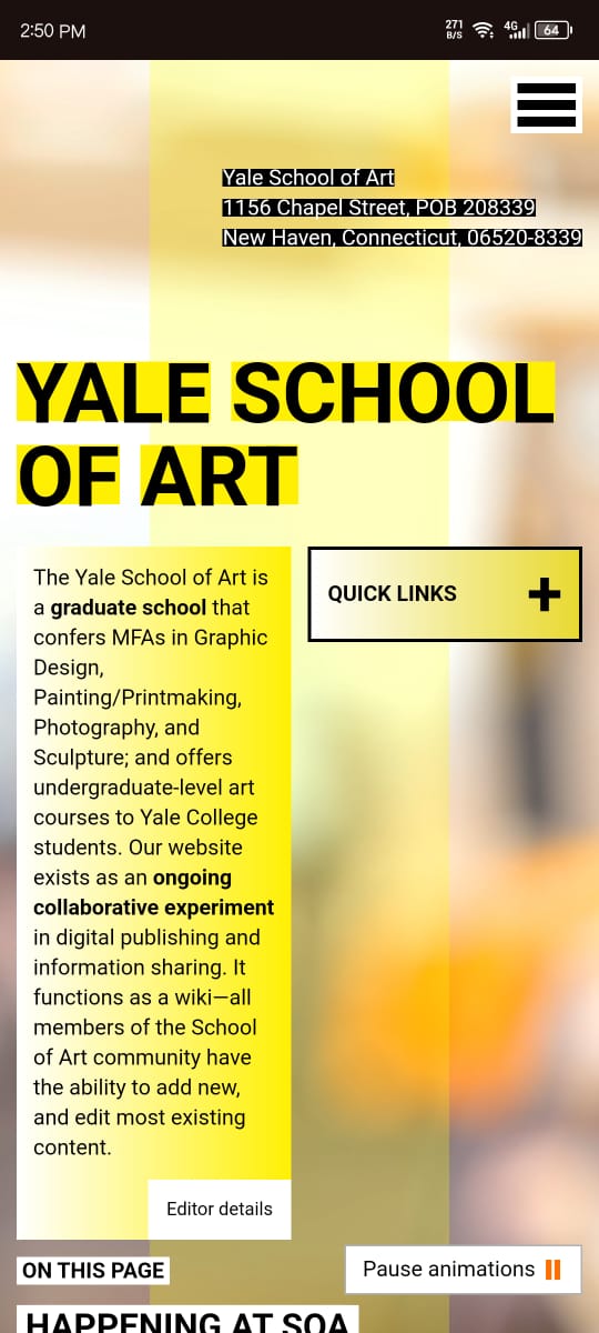
Yale Bad Accessibility Website | art.yale.edu
If you’re looking at this website from your phone, it will look different, it’ll look like it’s somewhat okay (layout-wise, of course, many aspects are bad too). But, from a computer screen, the layout is awkward. The content is just half of the screen not to mention the complete lack of structure.
Also Read: Web Design Trends 2024: The Booming Design Trends
Get Away From the Bad Website Design!
Bad website design can take many forms, from cluttered layouts to poor accessibility. There are accessibility guidelines to build websites so that people with disabilities such as color blindness can still navigate through them. Examining popular websites with bad designs and good ones can be a form of learning.
To ease your website-building journey, you can visit PLEINHAUS to find the perfect design for your website. Combine your ideas with our web designer expertise to make your imagination come true. Visit PLEINHAUS, your go-to studio for all website design, product design, UI/UX, and development needs.