Avoiding logo design mistakes is one of the creative challenges that many designers face. Making poor decisions in logo design will make the logo look bad. As a result, it couldn’t deliver the brand identity properly. That’s why you should know what logo mistakes to watch out for. Find insight regarding this in the following discussion!
10 Common Mistakes in Logo Design
The following list explains common errors in logo design you should acknowledge!
1. Insufficient Research
Researching before start designing a logo is a pivotal step in your creative process. It can help you to stay inspired and get valuable insight to create a unique logo design.
Ensure you gather information about the brand thoroughly, including the brand’s vision, mission, value, and target market.
Also Read: Choose a Font For Your Logo: A Guide & 15 Options
2. Intricating Logo Design
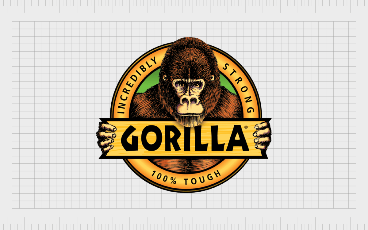
Though a complex logo will make your logo look unique, a simple design is better. Too many components in your logo will confuse your audience. Thus, they will quickly look away from your brand.
Making a simple logo but leaving a good impression on people would be more efficient than making a complicated logo.
3. Ignoring Your Audience
Forgetting your target audience is one of the biggest logo design mistakes. Imagine you are in a law firm business, but your logo is colorful and playful. Of course, it would attract the wrong audience, or people will simply not believe in your brand.
Consider making a logo that reflects your brand while resonating with your audience’s preferences for a better emotional connection with them.
4. Poor Font Selection

Typeface selection is essential for your logo design. That’s why poor font selection or mispairing fonts can be fatal mistakes for your design. Be careful to choose the type of font to represent your brands. Be sure that the font is not only attractive but also legible.
5. Poor Color Choice
Similar to typography, color selection is also significant to your logo. Good color pairing will help convey the messages you want to share. However, if you choose the color carelessly, you will ruin the overall design.
Therefore, choosing the ideal colors for your logo design will help you avoid this issue.
6. Unresponsive Logo

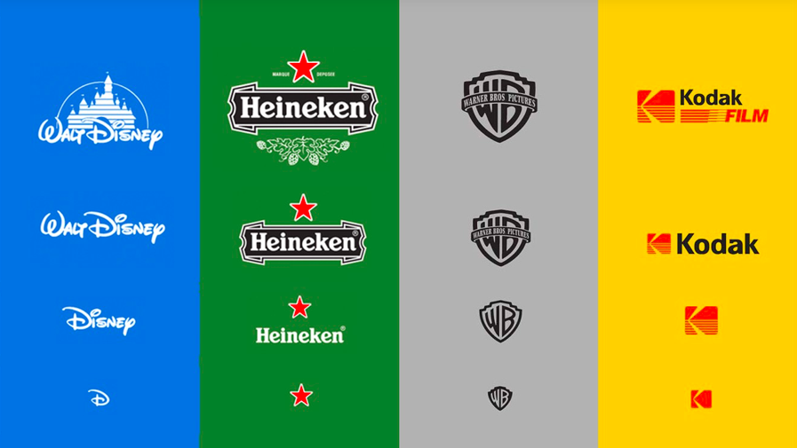
Not making your logo responsive may be one of the logo design mistakes you overlook. A responsive logo means that you prepare several logo designs for multiple platforms. Though it seems a lot of work, making a responsive logo is efficient for your branding.
Since many platforms have diverse screen dimensions and resolutions, a one-for-all logo is less effective for branding. For this reason, you need an adaptable logo to keep your brand relevant.
Also Read: Responsive Logo: Optimize Your Logo for a Dynamic Branding
7. Inconsistent Design
Inconsistent logo design will confuse your audience. Hence, your brand will be hardly recognizable to them. To avoid this issue, you must create a consistent logo.
Think about your trademark or unique point in your branding. Then, use that trademark for your responsive logo. For example, you may be already familiar with the Apple product from their memorable bitten Apple logo.
8. Too Generic Imagery
To compete with other competitors, you must introduce your brand from a unique perspective. You can try using generic imagery in your logo design to make a design that stands out from the crowd.
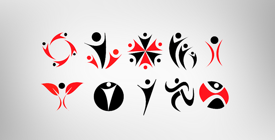
For example, the “V-man” logo is a common symbol representing people or communities. You’ve seen many brands use this logo, which makes it too ordinary. That’s why you should think of another symbol. Be sure the logo is different from others but relevant to your brand and audience.
Also Read: How To Win Logo Design Contest: 5 Ways to Boost Your Odds
9. Following the Trends Blindly
This issue is one of the common logo design mistakes. Being updated with the current trends is a good thing. But you must remember that trends always come and go. You will waste time on unnecessary change If you follow the trends recklessly. In the worst case, your audience won’t recognize your brand.
Try to make a timeless logo that is resistant to any trends. It would be more convenient and money-saving.
10. Inappropriate Logo Design
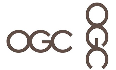
This mistake can be unintentional, but it can lead to misunderstanding, for instance, the way you layout or arrange the logo element. Be careful when designing logos to avoid misunderstandings or inappropriate logos. Always ask for feedback to give you new insight about your design.
Also Read: Logo Design Trends: 5+ Trends to Elevate Your Design
Don’t Fall Victim to Logo Design Mistakes!
You can avoid logo design mistakes by doing proper research and also apportion trials.
For instance, you can start to experiment with the layout and font pairing. Find the right combination of fonts that suit your brand identity. Try various font styles for new inspirations for logo design.
Creatype Studio has several collections to help you with. Moreover, you can try all the fonts for $1 only. This way, you can find the ideal font for your logo design. Check our website now!
